Over the past decade, I’ve built a substantial library of original digital Dijital art—whether for personal projects, learning new techniques, or professional work. A few months ago, I set out to find a clean, modern way to bring all of these assets online as a showcase of my career output.
This site, along with all its graphics and multimedia, is the result of that effort. While the content largely represents my work history, the site design and underlying code represent the future. Read on to learn what makes this website stand out.
Showcasing the Past While Embracing the Future
Built with a fully responsive, HTML5 and CSS3 layout, this site adapts to devices and screen sizes of all proportions. From a design perspective, I’ve never been fond of serving a stripped-down mobile template while reserving all the bells and whistles for larger screens. Below are the key principles that guided this design.
Adaptive
The layout and graphics adapt to the screen size and resolution of the viewing device. Whether you’re on a desktop, laptop, or smartphone, you see the same content—optimized for your screen.
Try resizing your browser window to see the layout shift from 3 columns to 2, down to a single column for smaller devices.Evolved
HTML5 and CSS3 combined with jQuery make this a forward-looking, standards-based website. While not every feature works in the oldest browsers, it fully leverages all current and upcoming standards-based browsers—including mobile.
Originally, I implemented jQuery animation, but found performance lacking on mobile devices. For that reason, all animations are fully hardware-accelerated CSS3 for smooth performance on supported hardware. On incompatible hardware and older browsers, JavaScript provides a fallback.
The sliders are fully touch-enabled and tuned for better response on Android. By default, Android browsers introduce a slight delay to touch response—using some clever JavaScript, I removed this delay to make interactions feel instant, matching mobile Safari on iOS.
Original
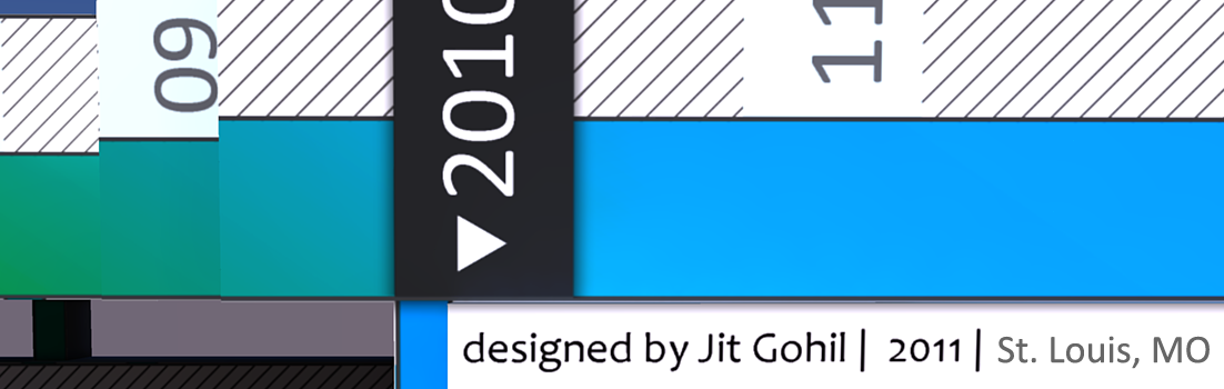
One of the most challenging parts of this project was developing an original design. While I knew the site would be minimalist to keep focus on the content, I felt the resume needed something more. I had the idea to take the timeline from my formal resume and transform it into a visual representation of my career as an infographic. Starting with paper sketches, I created a rough outline, then designed it in Adobe Illustrator. After finalizing the layout, I brought the image into Google SketchUp to add depth. It was an involved design that gave me an opportunity to showcase a cross-section of my skills. Check out this post for a glimpse into my entire design process.
Optimized
Beyond semantically clean HTML5, the site uses the wp-supercache plugin for fast loading and response times. All URLs are rewritten to be SEO-friendly, and the taxonomy is tuned for optimal search results.
Even the gallery images are lazy-loaded via AJAX to ensure the UI remains responsive and initial page-load times stay low.